


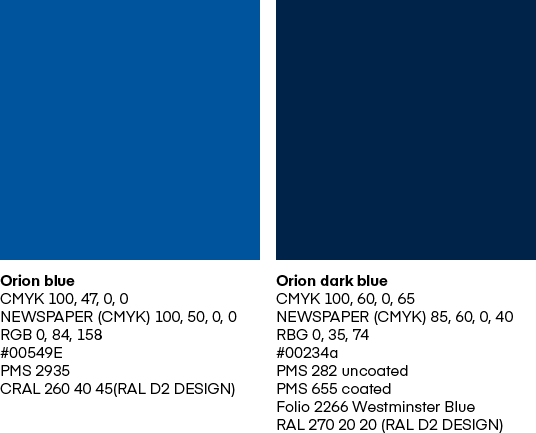
Primary colours
The primary colours used are Orion Pharma blue and Orion Pharma dark blue.
|
Orion blue |
Orion dark blue |
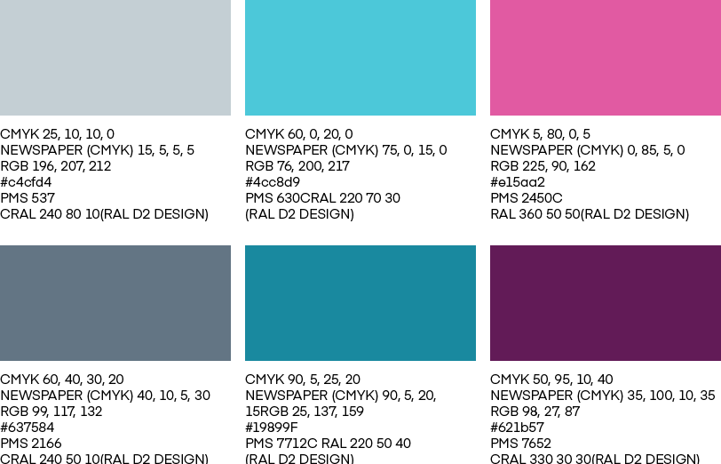
Secondary colours
In addition to the primary colours, six secondary colours can be used.
|
CMYK 25, 10, 10, 0 |
CMYK 60, 0, 20, 0 |
CMYK 5, 80, 0, 5 |
|
CMYK 60, 40, 30, 20 |
CMYK 90, 5, 25, 20 |
CMYK 50, 95, 10, 40 |
Special colours
Special colours are used only on a case-by-case basis to complement the colour palette in illustrations or as an effect colour in campaigns, for example. Special colours should not be used as main colours. Special colours are not used in graphs.

|
CMYK 50, 0, 45, 0 |
CMYK 0, 5, 75, 5 |
Graphic elements – Colours
Graphic elements have specifically defined CMYK and RGB colour values. The colour sets of the elements are always built from theinside out. Defined colours are used only to build the colour sets of graphic elements.

Do’s & Don’ts
Study these examples on the use of colours to ensure a consistent brand experience.

Do
- Use the primary colours Orion Pharma blue and Orion Pharma dark blue as much as possible and on large surfaces.
- Use white in your design or layout as needed to maintain a clear look.
- Use secondary colours together with primary colours to highlight text or deepen the visual look.
- Use special colours only on a case-by-case basis to complement the colour palette in illustrations or as an effect colour in campaigns, for example.
Don’t
- Gradients and colour shading are not permitted.
- Don’t mix the different colour schemes of graphic elements in same layout, asset or presentation (turquoise, pink or grey).
- Avoid using too many colours in a single design.
- Special colours should not be used as main colours on large surfaces. Special colours are not used in graphs.