


Jump to section: Logo | Typography | Graphic elements | Colours | Images | Pronunciation
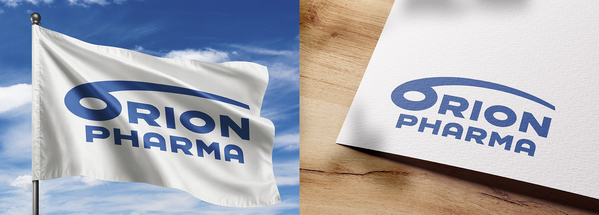
Logo
The Orion Pharma logo is an ultimate expression of the Orion Pharma brand. Its blue color reflects the brand’s Nordic heritage, as well as reliability and responsibility.
The capital letter O is a visual interpretation of a retort – a device used for distillation in chemistry laboratories.
![]()
Protective field and dimensions
In all situations, a protective field must be left around the logo. In Orion Pharma, the size of the protective field is based on Orion’s letter O. You cannot place any other elements inside the protective field.
The protective field ensures that the logo is distinguished from the surrounding elements and that the sign is not set too close to the edges of different products.
The minimum width of the Orion Pharma logo is 30 mm. The adjacent figures show the measurements of the protected areas and proportions.
Read more: the use of Orion Pharma logo
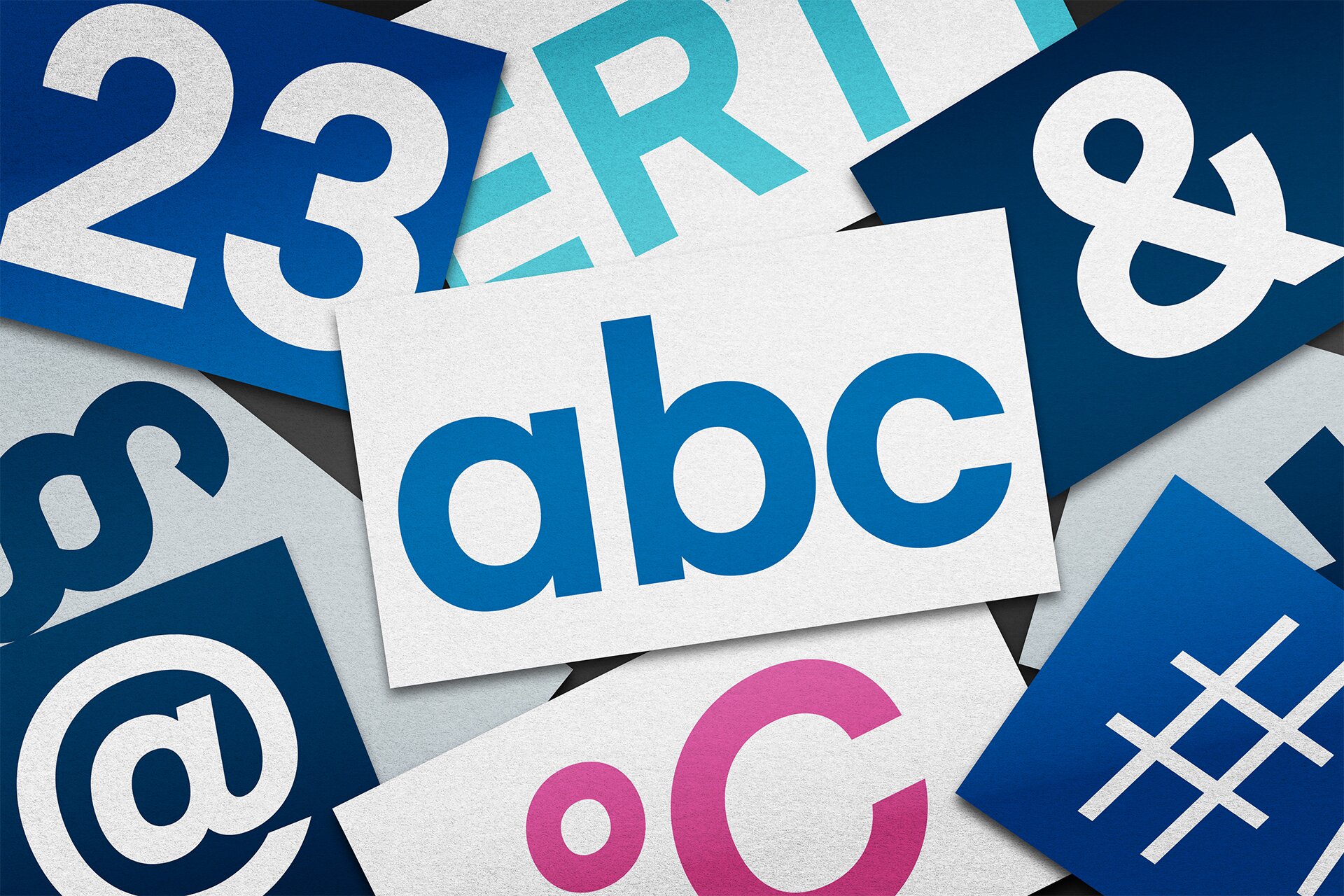
Typography
Orion Pharma brand has a clear and consistent typography, ensuring brand recognition through well-defined fonts that balance professionalism and readability across all mediums.
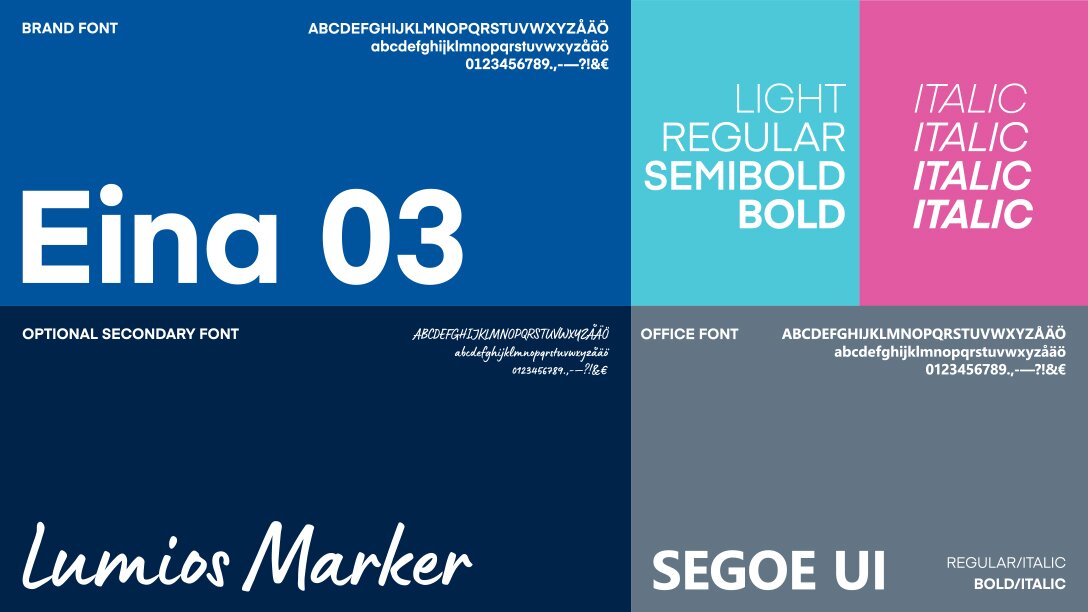
| Brand font The brand font is Eina 03 typeface with various editions. The brand font is used in all Orion Pharma materials, including online. |
Office font In an Office environment, the Segoe UI typeface is used as a substitution. |
Optional secondary font The secondary font is Lumios Marker, used only in headings and various elevations and callouts. |
Read more: the use of Orion Pharma brand fonts
Graphic elements
Our graphic element used broadly in brand materials is inspired by a real microscopic image. The element library consists of three different shapes, each available in three different colour themes.
Graphics are intended to be composed on surfaces in well-proportioned layouts, the aim of which is to create a three-dimensional atmosphere. Different compositions are delivered ready for use.
Individual graphic files are meant for graphic design professionals.

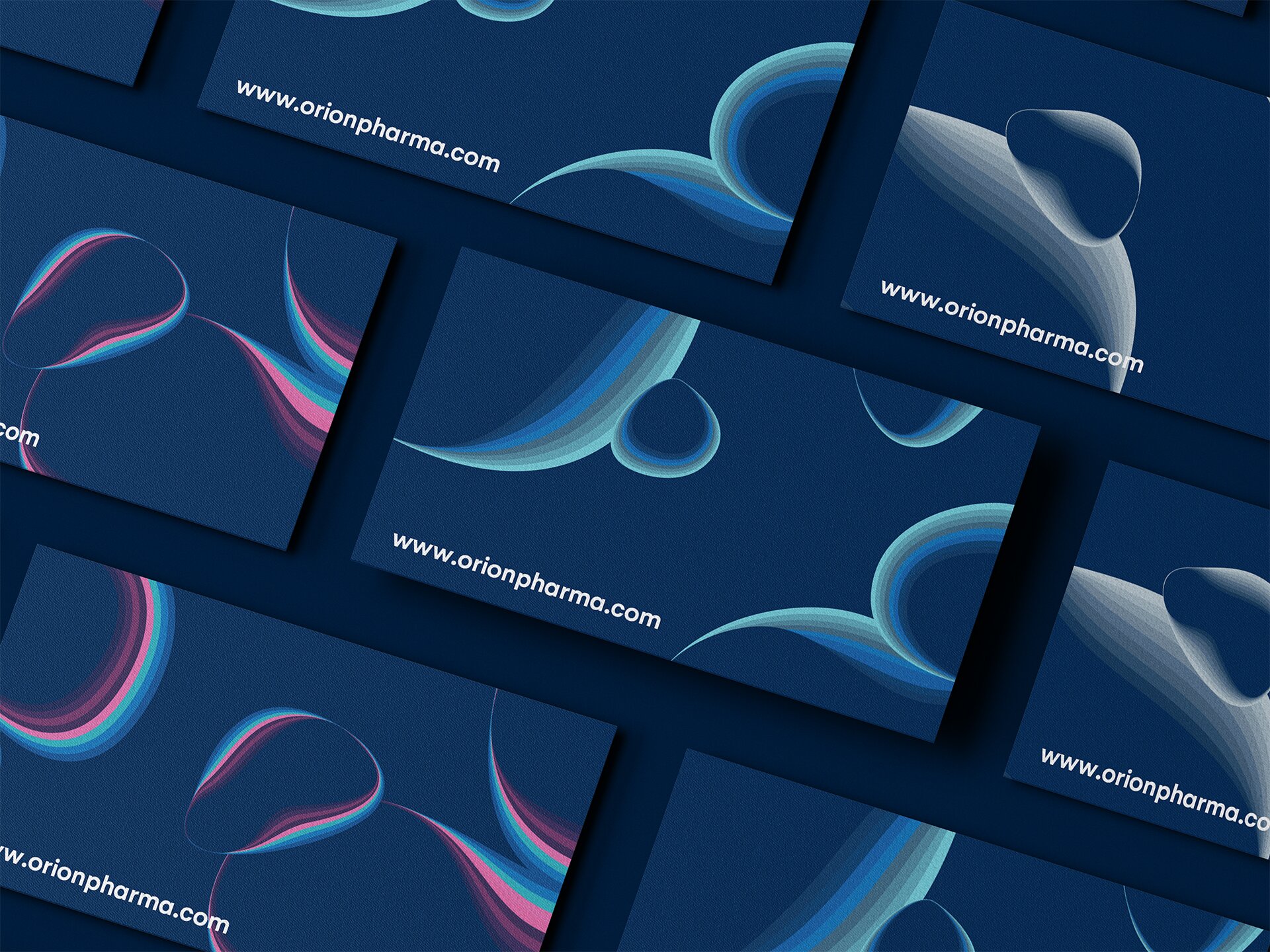
Read more: the use of Orion Pharma graphic elements
Colours
The Orion Pharma blue and dark blue draw their inspiration from our Nordic heritage. The colours often associated with clear skies and clean lakes in the Nordics, also stand for reliability and responsibility – values that are highly appreciated in our field of business.

Our primary colours are complemented by six secondary colours, and two special colours that bring a natural richness to our brand visuals. Our versatile colour palette is brought to life with visual elements that all contain smart details derived from the medical world.


Read more: Orion Pharma brand colours
Brand images and videos
Orion Pharma brand images are indented to be used in connection with Orion Pharma brand, including in websites, presentations and other digital materials. Brand images should be reserved for use in permanent materials and advertising related to Orion Pharma brand.
Brand images should not be used for daily content creation, such as social media posts, which require more dynamic and frequently updated visuals. In daily updates, use additional images based on the topic in hand.


Read more: Orion Pharma brand images and videos
Phonetics & pronunciation
In official materials, such as outros, Orion Pharma is pronounced according to Finnish tradition. However, in speech, Orion Pharma can be pronounced in a way that feels natural in one’s native language. This approach helps maintain local relevance when Orion Pharma is discussed.
Tone of voice
Orion Pharma tone of voice ensures a reliable, human-centered, and consistent experience for all audiences. By using the same voice across all communications, we make our messages clear, engaging, and easy to connect with.
