


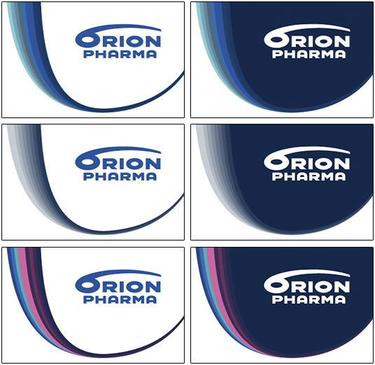
Microscope graphicsOur graphic element used broadly in brand materials is inspired by a real microscopic image. |
 |
The combination of graphic elements and logoThe microscope graphic is available as an outline that can be used together with the Orion Pharma logo. A combination of logo and graphic elements can be used especially with photos or brand marketing material. |
|

Do’s & Don’ts
Study these examples on the use of graphics to ensure a consistent brand experience.
Do’s
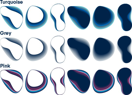
- Use only one colour scheme per layout, asset or presentation (turquoise, pink or grey).
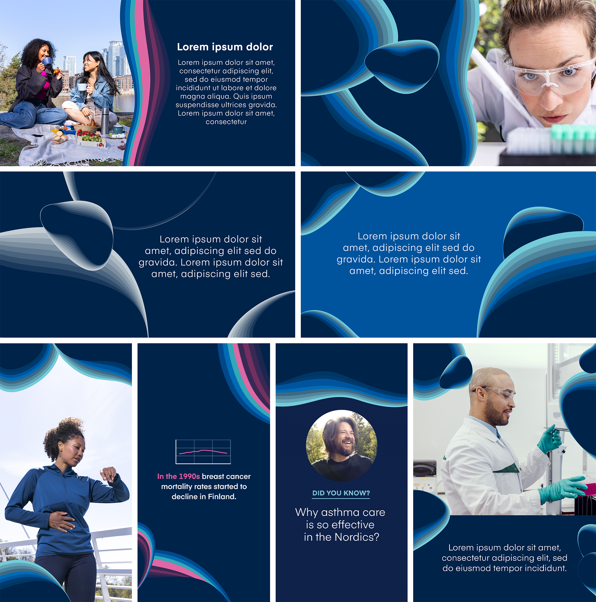
- Compose and scale the graphics on various even-colour surfaces.
- Use only the correct colour surfaces as base: blue, dark blue, light grey, and white.
- Build a uniform surface by allowing elements to partially overlap.
- You are able to use the graphics to separate an image and a text area.
- Reserve an even-colour surface around the graphics for text layout.
- Always leave unoccupied space around the text.
Don’ts
- Don't combine different colour schemes in same layout, asset or presentation (turquoise, pink or grey).
- Don’t place any text over the graphic elements.
- Don’t place the graphic elements and text too close to each other.
