


Our logo features the words Orion Pharma accompanied by a retort symbol that extends from the letter O.
The only logos allowed in Orion Pharma materials are Orion Pharma logos. Any additional texts should be created as wordmarks with Eina 03 font, found in the Guidelines section under Typography.
Wordmarks are our way of giving a distinct typographic treatment to different initiatives, partnerships or concepts in Orion Pharma, that we need to communicate around.
In addition, Fermion and Orion Pharma Animal Health logos are used according to individual brand guidelines.
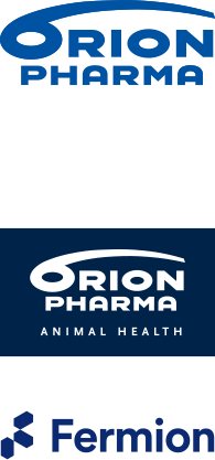 |
The colour of the Orion Pharma logo is blue CMYK 100, 47, 0, 0 RGB 0, 84, 158 #00549E PMS 2935 If colours can not be used, the logos are printed in black. The colour of the Animal Health logo is CMYK 100, 60, 0, 65 RBG 0, 35, 74 #00234A PMS 655C The colour of the Fermion logo is CMYK 100, 93, 27, 15 RBG 11, 42, 113 #0B2A71 PMS 280 |
Protective field and dimensionsIn all situations, a protective field must be left around the logo. In Orion Pharma, the size of the protective field is based on Orion’s letter O. You cannot place any other elements inside the protective field. The protective field ensures that the logo is distinguished from the surrounding elements and that the sign is not set too close to the edges of different products. DimensionsThe minimum width of the Orion Pharma logo is 30 mm. The adjacent figures show the measurements of the protected areas and proportions. |
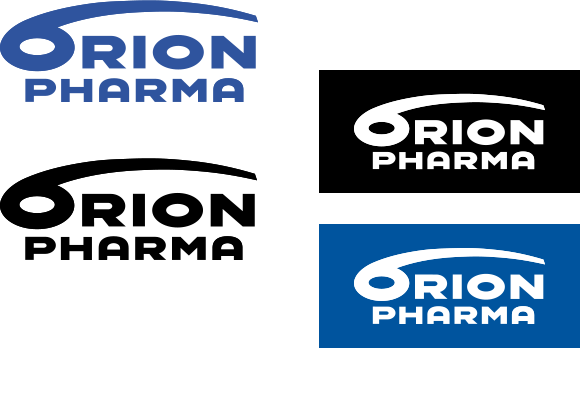 |
Unicolour logosPrimarily, the blue options specified earlier are used. Monochrome blacks or whites are used only when multicolour printing and/or repetition of different colour shades is not possible. The use of a white logo on a blue background or on top of an image is also allowed on a website or in a video, for example. |
Do’s & Don’ts
Study these examples on the use of logo to ensure a consistent brand experience.
Do
- Orion Pharma logo is always clearly visible in all Orion’s materials, layouts, and sites.
- The logo is always blue unless the background colour or print material requires otherwise (white or black version).
- Always maintain a sufficient clear space around the logo.
Don’t
- Don't alter the logo in any way.
- Never combine any text or words or other brands with the Orion Pharma logo.
- Don't combine our slogan “Building well-being” under the logo.
- Don't edit the logo too small. The minimum size is 30mm. Maintain the correct proportions of the logo. Avoid stretching or distorting the logo in any way
- Never position the logo over faces, cluttered backgrounds, or any elements that could compromise its integrity.
- Don't add any effects: Applying unnecessary effects like shadows, gradients, or outlines that were not part of the original design.
